Monday, 12 May 2014

Final product

This is the finished content, cover and double page spread of my magazine:


Friday, 21 March 2014

Evaluation Question 7

Looking back at your preliminary task, what do you feel you have learnt in the progression from that to your full product? 


After looking at these two screenshots, one being my actual finished magazine front cover and the other being my preliminary magazine front cover, I can see a few dramatic differences.
For example looking at the colour schemes, on 'The College' cover I have used a burgundy and white colours and on TMM I have completely changed and used purples. I believe the decision behind this was to make it fit more with what my target audience would like to see and I personally believe that the colours used on the left screenshot were possibly too vibrant.  Another thing that has changed from my preliminary is the model (obviously), but looking at the left model you can see that she doesn't necessarily know what to do, in comparison I found it easier to direct the model on the right and tell her how to stand, which kind of facial expressions to pull etc. Furthermore you can see from the preliminary that the writing on the covering the image up, whereas after playing around on Photoshop I was able to figure out how to place the title behind the model.  

The fonts on the my preliminary were simple and at the time I thought fitted the magazine concept, however for my actual magazine I decided to use fonts from an online website named DaFont.com, they had a wide variety of fonts to choose from and as you can see I chose something basic but also affective as I believe it stands out and will attract my target audience.

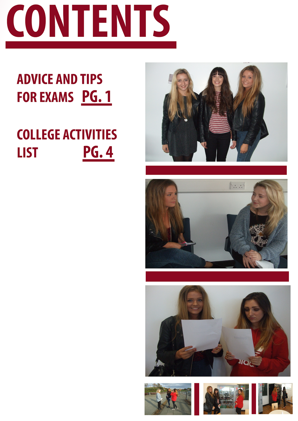
Moving on to my current contents page and my preliminary contents:
 
 
As you can see my preliminary task contents page was very bland and didn't stand out or contain enough information, contrastingly my TMM contents has a lot of information, colour and images which will stand out to my target audience. Also looking at the two different layouts or my magazine, you can tell by looking at the left image there really isn't a layout that anyone could follow, however for the other contents page I have ensured that I created different sections to make it easier for the reader to follow and find certain things.
Something else I thought would be important to include in my contents page was a down bar reassuring the readers that they can follow us on all types of social media sites to keep up with the news.
 
Overall I think that my final product is a lot better than my preliminary task, for the reasons stated above, but I also believe that having a go at using Photoshop for the practice gave me more confidence and enabling me to create a decent final contents, cover and double page spread.
 

Sunday, 19 January 2014

Evalution Question 6

What have you learnt about technologies from the process of constructing this product?
 
This project has taught me a lot about a vast amount of technical side of things. For a start I bagan using a Mac computer, which was at first rather hard to adjust to as I had never worked on one before, but once I began to work with it more and more I found out that it was particularly hard to work. Overall I do feel comfortable with using the Mac and I believe it has better facilities than other computers, so I am more confident in the fact that I have composed a good enough product.
 
To take my images I had to use a camera, the Canon Ixus 105. I didn't find this a difficult task as I have used many different camera's in the past. So once I had my images I had to transfer them to the Mac and I did this by firstly using a cable which went into my camera and my laptop, then I saved the images onto my memory stick which fits into the Mac. I found this rather easy as I have done it numerous occasions.

I began using photoshop, on the Mac, to complete part of my work. I, again, struggled with this software, fortunately though my friend knew how to use so was able to help me, so after a few lessons I got to grips with it and after this I was more at ease with this software and could do quite a lot, like editing my model, removing backgrounds etc.


Wednesday, 15 January 2014

Evaluation Question 5

How did you attract/address your audience?
 

I addressed my audience by using sell lines. The sell lines included things such as 'free posters' and listed many different, famous artists within this industry, making the audience feel more attracted to the magazine and hopefully want to buy it.

 
To attract my audience I used colours which I believed would turn my audiences heads. The colours coordinated and contrasted very well. Another thing which attracted my TA was the model I used for my cover. She is the typical indie girl, dressed appropriately and makeup is natural-esc.

Monday, 6 January 2014

Evaluation Question 4

Who would be the audience for your media product?

My magazine is aimed at both males and females of around the ages of 16-21. They have the typical Indie interests such as gigging, socialising, listening to music, Festivals etc. My magazine cover I think is something that my TA would find attractive and if they saw it in a shop they would immediately think about picking it up. Just by looking at the image used on the cover I think that the females will admire the clothing, hair and makeup and aim to look like her and I think the males will be attracted and think she looks pretty 'cool'.
Once the TA open up the magazine and look at the contents page they will be greeted by bold purples (this matches the front cover) and enough information to inform them what bands/artists are inside. There are also more images of the cover girl which may interest the audience even more. 
I asked a friend of mine, who enjoys reading the likes of NME and Q, what she thought of my cover page, contents page and DPS. Her response sounded something like this:
 "I really like the colours which have been used on both the over and contents, as they match and make the writing understandable but also very bold. Another thing which stands out to me is the bands that have been included as they match the genre of the magazine perfectly!"

Evalution Question 3

What type of media institution might distribute your media product and why?
 I believe that IPC Media would distribute my magazine because it works along side NME, which is a dupe of my magazine. They are of the same genres. If they sell a lot of copies of NME, then audiences may be more likely to buy mine.
My magazine will be distributed through shops and there is also an online subscription which readers can use if they wish, as it may make the payments easier for them. 
"IPC Media ltd, a wholly owned subsidiary of Time In., is a digital publisher in the United Kingdom, with a large portfolio selling over 350 million copies each year."
This makes me feel more confident in choosing this media institution as it tells me that it sells over 350 Million copies each year and by them publishing my magazine there will be a greater income.

Sunday, 5 January 2014

Evalution Question 2

How does your media product represent particular social groups?
As you can see from the image my model is looking directly at the camera. The image is a medium shot as I wanted to ensure that my models clothing/hair would be shown on the image, I believe that is what the readers would prefer because they like to see exactly what their favourite artists are wearing so they can in a way use them as a template. As you can see by looking at the other image there aren't many similarities apart from the fact that it is also a medium shot. The fact that my image is looking right at the camera shows quite and empowering side to them and entices the audience as once they look at the magazine they will immediately see the main model which will draw them in even further, the image on the right shows quite a provocative shot of a female singer, this contrasts with my image a lot as my magazine does not premote those type of things. I decided to have my model standing in-front of a white backdrop to create more of an effect and I've noticed that other typical indie magazines have plain backdrops, Q magazine have completely gone against my technique and have instead opted for a black background. The clothing my model has on is that of the type of thing you would see the likes of Indie 'guru' Alexa Chung wearing, alongside the hair and the opposite picture is a typical pop culture image, trying to change peoples persepctive of the model at hand.  

Evalution question 1

In what ways does your media product, use develop or challenge forms and conventions of real media products?
My magazine uses conventions of other magzines as I used certain ones as a template when designing my product. My magazine is made up of different elements such as:
  • Masthead
  • Barcode
  • Sell lines
  • Banners
  • Date
  • Price
  • Issue number
  • Main image
This is a grouped image of my work with all the different elements on it. As you can see in the banner I have written particular information that I think will attract the audience and make them want to buy the magazine. I have basically included information that I find necessary for my genre and have not added any irrelevant things as I find that it ends up just looking stupid.


I picked an appropriate model which fitted my target audience. I added makeup and clothing which I thought the likes of Kate Moss and Alexa Chung would wear. Overall I am pleased with how my images turned out and found it a rather easy process to do.

Here is a link to my Prezi to see my work more clearly:
http://prezi.com/tvgeyrj4sswn/?utm_campaign=share&utm_medium=copy&rc=ex0share

Sunday, 29 December 2013

Finished Contents

This is a screenshot of my finished Contents Page. If you look at my previous post you will see the dramatic differences between the two of them. The contents page took around 5 hours to create. I used Photoshop to bring my design to life. I followed my colour scheme, in a way, I used purples because I think that they contrast well together and fits with the genre of the magazine. 

As you can see I have included seven different page numbers with mini articles surrounding them, it also has the date, 2 images and a footer. I have added these all in to basically make the magazine look more professional, I believe it will pull the TA in and want to buy it.

The hardest part about creating this contents page was trying to fill in the dead space, I had to think of different things to include, talking about which bands were used in my magazine. Positives of making this though were actually seeing my finished piece, I am very proud of it.

Overall I am extremely pleased with the my final product, I think it looks professional. I also hope that attracts my specific target audience and I am sure it will. 


Sunday, 22 December 2013

General research into my target audiences attitudes and interests

For this part of my task I have decided to do some research into my T.A. I will be looking for certain things such as what they like to do in their spare time, hobbies, interests etc. 
 
To help me carry out this research I looked at similar magazines such as NME and Q. This gave me an understanding of what kind of things I should include in my own magazine. I looked at certain words which were used a lot, I shall try to incorporate some of them into my own work. By looking at these particular magazines it gives me a better understanding of what my target audience like to see, such as the type of bands/artists used and also gives me an insight as to what exactly the magazine should include for example; quizzes, posters,
reviews etc.
 
When looking at my model and seeing how she has been presented I notice similarities between other artists within the 'indie' music industry. The image on the left is my model and the right is of Lily Allen. Noticeable resemblances are clear such as they are both wearing striped t-shirts, their hairs are up (same colour) and the makeups are both minimal, very natural.
 
So after reviewing different singers such as Lily Allen I now know that my target audience are or would be fans of her and her style.


Tuesday, 3 December 2013

My magazine so far


This is a screenshot of my cover page so far. As you can see it has simple colours and the information is limited, although there is enough there to alert the audience what the magazine will include on the inside.
I have made a few changes to my magazine. For starters I have included white backgrounds, situated behind the text, this makes the image stand out from the writing and also makes the writing easy to understand and read.

Sunday, 1 December 2013

Review of the pleniminary task

As part of my pleniminary task I had to design a magazine cover and contents page. As you can see from the screenshots below they are not of a particularly high standard and actually rather poor. I have not finished the contents page and it doesn't look at all professional. I don't think that the cover page is really bad but again is not up to the standard of a professional standard.  


Wednesday, 20 November 2013

Contents Page- So far

This is a screenshot of my contents page so far. As you can see it is incomplete. But I have  placed the title at the top left hand corner and it has the words 'TMM Contents', the reason which I have named it this is basically so the reader understands what page they are on.

I have also added a picture of my model, the image is of her getting ready for the photo shoot. This gives the reader a taster of what the magazine will contain. It is something that the reader can relate to, seeing that she applied her own makeup, which makes her seem more down to earth. 

I understand that this needs a lot more work to be done to it. I need to include a background and page numbers (information telling the reader what is on certain pages) etc. 

Thursday, 14 November 2013

Photo shoot Preparation


 I took some photos of my model whilst she and I were preparing for the professional shots. As you can see (image at the left) I put my models base makeup on; the eyeshadow, lipstick etc. I also did her hair, I place to ordinary plaits by her the sides of her head and then folded them over the top. I picked this hairstyle because I think it fits my type of magazine, as I have seen the likes of Alexa Chung donning this hairstyle.  And finally I chose her clothing, as you can see in the first image she is wearing a Black polo shirt and in the second image she is wearing an oversized navy striped t-shirt. I have seen the likes of Kate Moss parading around in these outfits.
I am very pleased with my overall images, as I think they do look rather professional and something that my target audience would appreciate. 

Wednesday, 13 November 2013

Model Confirmation

I needed to screenshot the conversation between me and model, just confirming that she was still available to meet me at the specific time and date. She Was still able to meet me, as you can see from this screenshot.


Looking at Last Year's Student Work

We looked at previous students work and analysed them, by saying what was good and bad about it. We then graded it. We also wrote down what we have learned from looking and last year's students work and how we will apply that to our own work. I found this task very helpful as it has showed me what type of things I should include in my own work and certain that should not be on.

Quantative Research


As part of my research, I created a questionnaire. I asked people questions about what type of things they like about magazines, if they could change them what would they do etc.


1. Do you buy magazine often?

I asked my audience if they buy magazines often often and the top answer was yes. Out of the 10 people I asked 3 people said no. This has made me think that I should release the magazine frequently, possibly weekly, as the pie chart shows that people are buying them regularly. 


2. How often would you prefer magazines to be sold?

As you can see the majority of people I asked tend to buy magazines weekly, which again makes me think that my magazine should be published weekly. Not very many people seemed to buy magazines monthly this clearly shows that it would be a bad idea to only have mine out monthly.


3. Do you like it when a magazine offers readers free tickets etc.?


Only one person ticked the 'No' box for not liking it when the magazine gives the readers a chance to win something. I will definitely incorporate this into my magazine because I think the reader likes this as they have the opportunity to meet there favourite artists for free!   


4. What would you pay for a magazine? 

Most people ticked to pay £2.99 to pay for a music magazine. Nobody would pay £1.99. Therefore I have come to the conclusion that I will charge around £2.99 to £3.99. Only a few said they would pay £3.99 which has forced me to pick going within the region of the £2.99 and £3.99


5. What colours do you like to see on magazines?

I asked people which colour(s) they would prefer to see on a magazine and many people went with 'Simple colours such as: black and white'. I believe that these colours may be too plain for my magazine so I have opted with including another bold colour to make things stand out a little more. 

6. What kind of articles do you like to read?

I gave people the choice of; Interview, Quizzes, Reviews, Pictures and Other. The result came back with interviews ticked the most. So I will ensure that my magazine has an interview with an artists, to keep my readers interested and make sure they will buy it again.

7. What types of music do you usually listen to?

Rock, Indie, Pop, Classic and Other was the boxes people had to choose from. And luckily the majority of my peers ticked the Indie box. It is lucky because my magazine genre is Indie.

8. Have you ever been to a gig?

I asked if anyone had ever been to a gig/festival and if so which one. Yes was the top answer for going to a gig, but not as many people had been to a festival if they had it was the likes of Leeds or Download Festival. This helps me as it shows that people who will read my magazine have been to gigs so I can give them the chance ti have free tickets.

9. Where do you shop?

I asked this question purely to see where my TA shopped again so they could be in with the chance of winning vouches etc. The top answers were Topshop and Topman. 

10. Who are your favourite band or artists?

Finally I asked this question. And the answers given were bands such as Arctic Monkeys, Jake Bugg etc. I did get one answer saying Jessie J, she is more of a popstar and I will not be including her genre of music in my magazine. 

Monday, 11 November 2013

The Recce


I have decided to take my photos at my house; there will be a lower risk of anything happening. Although, either the model or I will need to watch out for certain things lying around the room. My Model will have straight hair therefore we will have the likes of straighteners hanging around so it is important that we keep a close eye on where these type if things are.

The weather will not particularly affect the way in which my model looks, although it may mean that I will have to postpone it for the fact that my model cannot make it due to the bad weather, but apart from that it does not risk my photo shoot. However the time of day may jeopardies the final outcome of my pictures, as I may need daytime lighting to help make the pictures look better. Fortunately I have arranged for my model to come to mine during the day.

I wish for my model to be standing in-front of a white back drop, mainly for the fact that it means that she will stand out and the target audience will not feel the need to get distracted. I am undecided about shooting outside, it will depend if I feel I can get a decent shot.

Using the flash on the camera will really enhance the models features and bring more colours out; therefore I probably will decide to use it when photographing my model. We will be working in a room without any distractions e.g. anything that could get in the way of my shots, reflect on to the model etc. (I will not need any permission to take my photos, as it will be in my own home.)

Due to the fact that I will be working in my own home there will not be a distraction from others, although my family may be in at the same time, but I will make sure I warn them in advance that I am working.
I have my own props, so I shall use them to help me find the right shot. Fortunately my model is someone that I already know and whom lives close, so it will be easy enough to invite her over to take my photos.  

Finally I need to make sure that I keep in contact with my model, especially a few days before we come to do the shoot, incase my model is unavailable.

My colour scheme

My colours

I have created a colour scheme. I have chose to use these because they match my magazine genre and are aimed for my target audience, male and female. The colours will contrast well with my model and the images in which I took. 


Sunday, 10 November 2013

Jarvis Cocker

I was asked to complete a practise magazine front cover as part of my preliminary task. We were notified that Jarvis Cocker must be used as the model on the front. I completed this by using Photoshop. I had never really used this before, so it was really all about finding my way around it and being creative. I believe that once I did have a few goes on photoshop my work was of an alright standard and I have slowly but surely found my feet with photoshop and have full confidence in using it in the future
However after looking back at my first attempt I think it is very obvious that I had never really used photo shop before as it isn't up to an actual magazines standard, in my eyes anyway. But again if I were to re-do this task I would be able to hand in a higher standard of work. 


Here is a screenshot of my preliminary task feedback. Overall I was told that my attempt at this cover was good, but I had to make sure that I made the writing around the image bold and stand out.