Wednesday 20 November 2013

Contents Page- So far

This is a screenshot of my contents page so far. As you can see it is incomplete. But I have  placed the title at the top left hand corner and it has the words 'TMM Contents', the reason which I have named it this is basically so the reader understands what page they are on.

I have also added a picture of my model, the image is of her getting ready for the photo shoot. This gives the reader a taster of what the magazine will contain. It is something that the reader can relate to, seeing that she applied her own makeup, which makes her seem more down to earth. 

I understand that this needs a lot more work to be done to it. I need to include a background and page numbers (information telling the reader what is on certain pages) etc. 

Thursday 14 November 2013

Photo shoot Preparation


 I took some photos of my model whilst she and I were preparing for the professional shots. As you can see (image at the left) I put my models base makeup on; the eyeshadow, lipstick etc. I also did her hair, I place to ordinary plaits by her the sides of her head and then folded them over the top. I picked this hairstyle because I think it fits my type of magazine, as I have seen the likes of Alexa Chung donning this hairstyle.  And finally I chose her clothing, as you can see in the first image she is wearing a Black polo shirt and in the second image she is wearing an oversized navy striped t-shirt. I have seen the likes of Kate Moss parading around in these outfits.
I am very pleased with my overall images, as I think they do look rather professional and something that my target audience would appreciate. 

Wednesday 13 November 2013

Model Confirmation

I needed to screenshot the conversation between me and model, just confirming that she was still available to meet me at the specific time and date. She Was still able to meet me, as you can see from this screenshot.


Looking at Last Year's Student Work

We looked at previous students work and analysed them, by saying what was good and bad about it. We then graded it. We also wrote down what we have learned from looking and last year's students work and how we will apply that to our own work. I found this task very helpful as it has showed me what type of things I should include in my own work and certain that should not be on.

Quantative Research


As part of my research, I created a questionnaire. I asked people questions about what type of things they like about magazines, if they could change them what would they do etc.


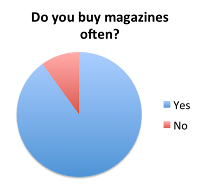
1. Do you buy magazine often?

I asked my audience if they buy magazines often often and the top answer was yes. Out of the 10 people I asked 3 people said no. This has made me think that I should release the magazine frequently, possibly weekly, as the pie chart shows that people are buying them regularly. 


2. How often would you prefer magazines to be sold?

As you can see the majority of people I asked tend to buy magazines weekly, which again makes me think that my magazine should be published weekly. Not very many people seemed to buy magazines monthly this clearly shows that it would be a bad idea to only have mine out monthly.


3. Do you like it when a magazine offers readers free tickets etc.?


Only one person ticked the 'No' box for not liking it when the magazine gives the readers a chance to win something. I will definitely incorporate this into my magazine because I think the reader likes this as they have the opportunity to meet there favourite artists for free!   


4. What would you pay for a magazine? 

Most people ticked to pay £2.99 to pay for a music magazine. Nobody would pay £1.99. Therefore I have come to the conclusion that I will charge around £2.99 to £3.99. Only a few said they would pay £3.99 which has forced me to pick going within the region of the £2.99 and £3.99


5. What colours do you like to see on magazines?

I asked people which colour(s) they would prefer to see on a magazine and many people went with 'Simple colours such as: black and white'. I believe that these colours may be too plain for my magazine so I have opted with including another bold colour to make things stand out a little more. 

6. What kind of articles do you like to read?

I gave people the choice of; Interview, Quizzes, Reviews, Pictures and Other. The result came back with interviews ticked the most. So I will ensure that my magazine has an interview with an artists, to keep my readers interested and make sure they will buy it again.

7. What types of music do you usually listen to?

Rock, Indie, Pop, Classic and Other was the boxes people had to choose from. And luckily the majority of my peers ticked the Indie box. It is lucky because my magazine genre is Indie.

8. Have you ever been to a gig?

I asked if anyone had ever been to a gig/festival and if so which one. Yes was the top answer for going to a gig, but not as many people had been to a festival if they had it was the likes of Leeds or Download Festival. This helps me as it shows that people who will read my magazine have been to gigs so I can give them the chance ti have free tickets.

9. Where do you shop?

I asked this question purely to see where my TA shopped again so they could be in with the chance of winning vouches etc. The top answers were Topshop and Topman. 

10. Who are your favourite band or artists?

Finally I asked this question. And the answers given were bands such as Arctic Monkeys, Jake Bugg etc. I did get one answer saying Jessie J, she is more of a popstar and I will not be including her genre of music in my magazine. 

Monday 11 November 2013

The Recce


I have decided to take my photos at my house; there will be a lower risk of anything happening. Although, either the model or I will need to watch out for certain things lying around the room. My Model will have straight hair therefore we will have the likes of straighteners hanging around so it is important that we keep a close eye on where these type if things are.

The weather will not particularly affect the way in which my model looks, although it may mean that I will have to postpone it for the fact that my model cannot make it due to the bad weather, but apart from that it does not risk my photo shoot. However the time of day may jeopardies the final outcome of my pictures, as I may need daytime lighting to help make the pictures look better. Fortunately I have arranged for my model to come to mine during the day.

I wish for my model to be standing in-front of a white back drop, mainly for the fact that it means that she will stand out and the target audience will not feel the need to get distracted. I am undecided about shooting outside, it will depend if I feel I can get a decent shot.

Using the flash on the camera will really enhance the models features and bring more colours out; therefore I probably will decide to use it when photographing my model. We will be working in a room without any distractions e.g. anything that could get in the way of my shots, reflect on to the model etc. (I will not need any permission to take my photos, as it will be in my own home.)

Due to the fact that I will be working in my own home there will not be a distraction from others, although my family may be in at the same time, but I will make sure I warn them in advance that I am working.
I have my own props, so I shall use them to help me find the right shot. Fortunately my model is someone that I already know and whom lives close, so it will be easy enough to invite her over to take my photos.  

Finally I need to make sure that I keep in contact with my model, especially a few days before we come to do the shoot, incase my model is unavailable.

My colour scheme

My colours

I have created a colour scheme. I have chose to use these because they match my magazine genre and are aimed for my target audience, male and female. The colours will contrast well with my model and the images in which I took. 


Sunday 10 November 2013

Jarvis Cocker

I was asked to complete a practise magazine front cover as part of my preliminary task. We were notified that Jarvis Cocker must be used as the model on the front. I completed this by using Photoshop. I had never really used this before, so it was really all about finding my way around it and being creative. I believe that once I did have a few goes on photoshop my work was of an alright standard and I have slowly but surely found my feet with photoshop and have full confidence in using it in the future
However after looking back at my first attempt I think it is very obvious that I had never really used photo shop before as it isn't up to an actual magazines standard, in my eyes anyway. But again if I were to re-do this task I would be able to hand in a higher standard of work. 


Here is a screenshot of my preliminary task feedback. Overall I was told that my attempt at this cover was good, but I had to make sure that I made the writing around the image bold and stand out.


Wednesday 6 November 2013

Font Ideas

I have researched different fonts to give me ideas for my own magazine. 
I have picked six unique fonts and have wrote down the pros and cons of 
actually using them in my own work.


Saturday 2 November 2013

Photographic Techniques

Photographic techniques

Some ideas and techniques are essential when taking a good photo:

  •       Shot distance
  •       Use of tilt
  •       Shot composition
  •       Eye line
  •       Tone
  •       Line
  •       Colour, including vivid, primary and monochromatic colour
  •       Texture, and hints on creating texture
  •       Patterns and hints on capturing patterns


Shot distance types:

  •       ELS/LS good for showing the insignificance of character of character or for showing characters as powerless within an overpowering environment. Also goo for establishing location.
  •       MLS/MS good for showing movement or for a balanced tacking of characters and their environment.
  •       MCU/CU good for portraiture or for moving image interviews.
  •       BCU/ECU good for showing the significance of character or for showing character as powerful. Also highly useful for drawing attention to character emotions.  

Tilt shots:

  •       Tilt up shot- used to convey power or dominance.
  •       Tilt down shot- Used to convey vulnerability or weakness of a person.

Tone:

·      Control of tones, including variations of light and dark, emphasizing parts of the image.
·      Tone control can be used to emphasize the shapes of the most important elements in your image.
Photographic/moving image techniques:
Composition:

  •     You need to think very carefully about how you compose a photograph.
  •       Many photographers place in their subject in the middle of the photograph, which can result in a dull image.

 Foreground/ background :

  •      You must always think about where the model will be photographed and remember to check the background out to ensure that there is nobody/anything accidentally in the back of the image. This should not be a problem for me as I am making sure my model will be standing in-front of a plain backing.
Framing:

  •       Keep the rule of thirds in mind when designing your shot. The views eye is drawn to the cross-sections of a frame, this is where your action should be taking place.

Lines:

  •       Lines are useful for emphasizing and leading the viewer towards a main area or subject.
  •      You can easily control the appearance of lines in your pictures by camera viewpoint.

Using colour:

  •       Taking control of the way in which colour is used in your photos is a key way of improving your images.
  •       Keep your eyes open for vibrant coloured subjects, but also look for delicate coloured subjects and ones with muted tones.
  •       Colour sells. Bright, bold colours are used on magazine covers, so choose or plan shots that you will take when producing your magazine cover.

    By looking over this it has helped me understand how I should take my photographs and what will look best for my product. I know what kind of lighting the photographs should be taken in and how my model should be positioned.