Sunday, 29 December 2013

Finished Contents

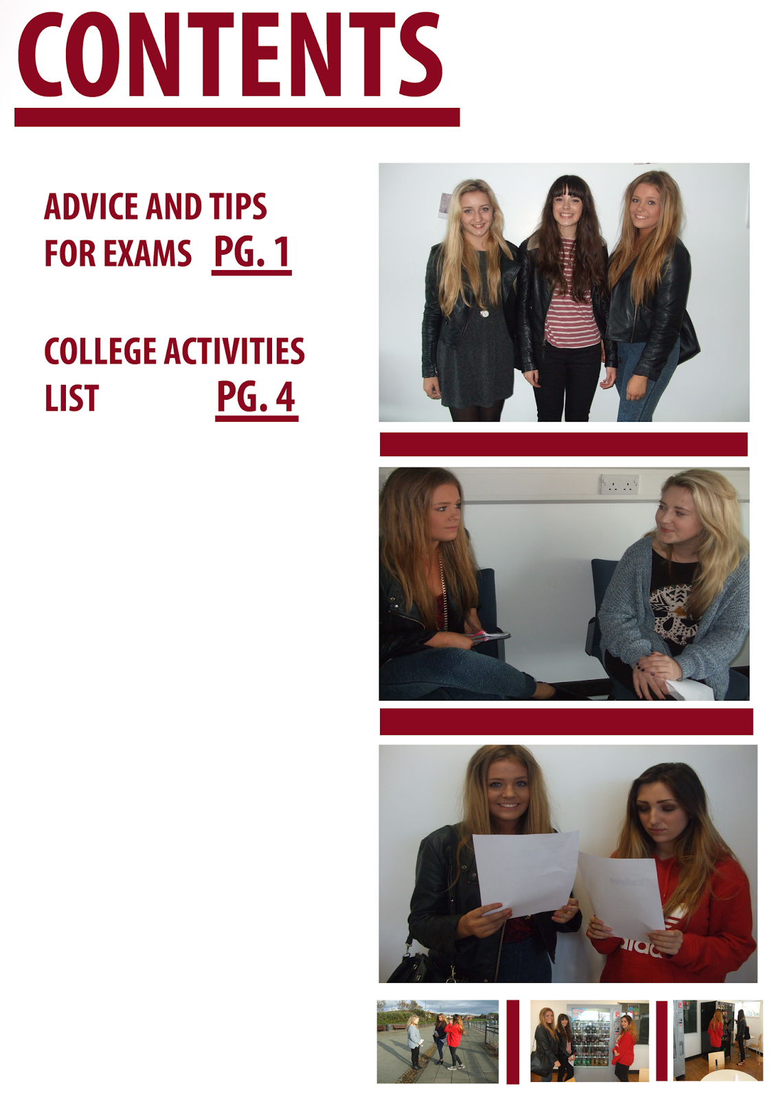
This is a screenshot of my finished Contents Page. If you look at my previous post you will see the dramatic differences between the two of them. The contents page took around 5 hours to create. I used Photoshop to bring my design to life. I followed my colour scheme, in a way, I used purples because I think that they contrast well together and fits with the genre of the magazine. 

As you can see I have included seven different page numbers with mini articles surrounding them, it also has the date, 2 images and a footer. I have added these all in to basically make the magazine look more professional, I believe it will pull the TA in and want to buy it.

The hardest part about creating this contents page was trying to fill in the dead space, I had to think of different things to include, talking about which bands were used in my magazine. Positives of making this though were actually seeing my finished piece, I am very proud of it.

Overall I am extremely pleased with the my final product, I think it looks professional. I also hope that attracts my specific target audience and I am sure it will. 


Sunday, 22 December 2013

General research into my target audiences attitudes and interests

For this part of my task I have decided to do some research into my T.A. I will be looking for certain things such as what they like to do in their spare time, hobbies, interests etc. 
 
To help me carry out this research I looked at similar magazines such as NME and Q. This gave me an understanding of what kind of things I should include in my own magazine. I looked at certain words which were used a lot, I shall try to incorporate some of them into my own work. By looking at these particular magazines it gives me a better understanding of what my target audience like to see, such as the type of bands/artists used and also gives me an insight as to what exactly the magazine should include for example; quizzes, posters,
reviews etc.
 
When looking at my model and seeing how she has been presented I notice similarities between other artists within the 'indie' music industry. The image on the left is my model and the right is of Lily Allen. Noticeable resemblances are clear such as they are both wearing striped t-shirts, their hairs are up (same colour) and the makeups are both minimal, very natural.
 
So after reviewing different singers such as Lily Allen I now know that my target audience are or would be fans of her and her style.


Tuesday, 3 December 2013

My magazine so far


This is a screenshot of my cover page so far. As you can see it has simple colours and the information is limited, although there is enough there to alert the audience what the magazine will include on the inside.
I have made a few changes to my magazine. For starters I have included white backgrounds, situated behind the text, this makes the image stand out from the writing and also makes the writing easy to understand and read.

Sunday, 1 December 2013

Review of the pleniminary task

As part of my pleniminary task I had to design a magazine cover and contents page. As you can see from the screenshots below they are not of a particularly high standard and actually rather poor. I have not finished the contents page and it doesn't look at all professional. I don't think that the cover page is really bad but again is not up to the standard of a professional standard.